
The Aperio
The Fine Print of Great Leadership
Hidden inside a familiar phrase was the story waiting to be told.
The Aperio was created to help leaders be worth following—which is great, but also generic. “Be worth following” can be a nice tagline, but without definition, it was just words.
By elevating the company’s keystone research project that shows 77% of leadership effectiveness stems from two core traits, we gave worth weight and meaning. That discovery shaped everything — from the new identity and icon to the client experience itself — and turned a leadership message into a leadership movement.
CREATIVE DIRECTION | BRAND STRATEGY | DESIGN EXECUTION

What Made It Work
Elements that helped the project land.
Clarity of Insight
Elevating a hidden research finding (77% of leadership effectiveness) into the core brand message.
Creative Hook
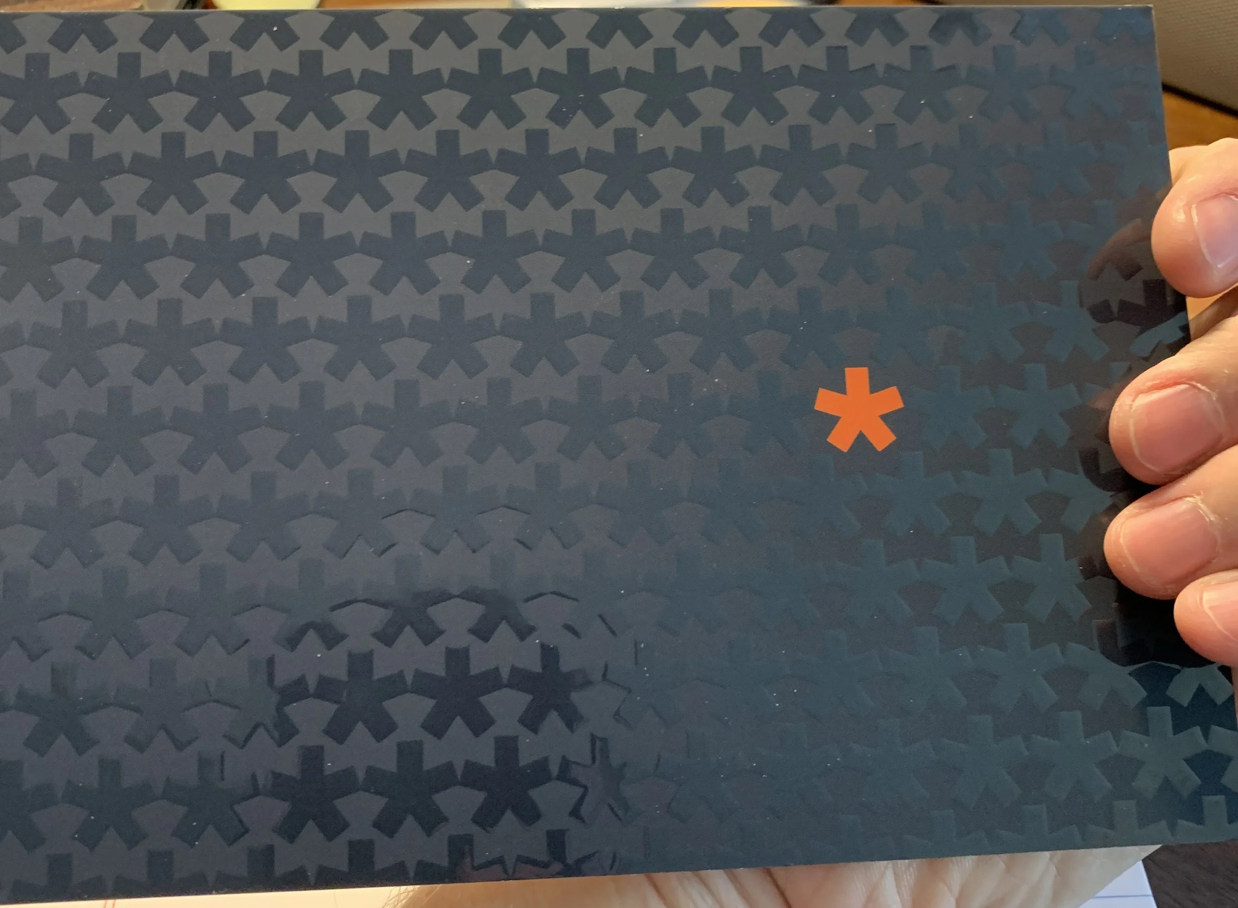
Using the asterisk as both a visual icon and a conceptual metaphor — the fine print of great leadership.
Integration
Extending the brand across identity, web, physical products, and a book launch.

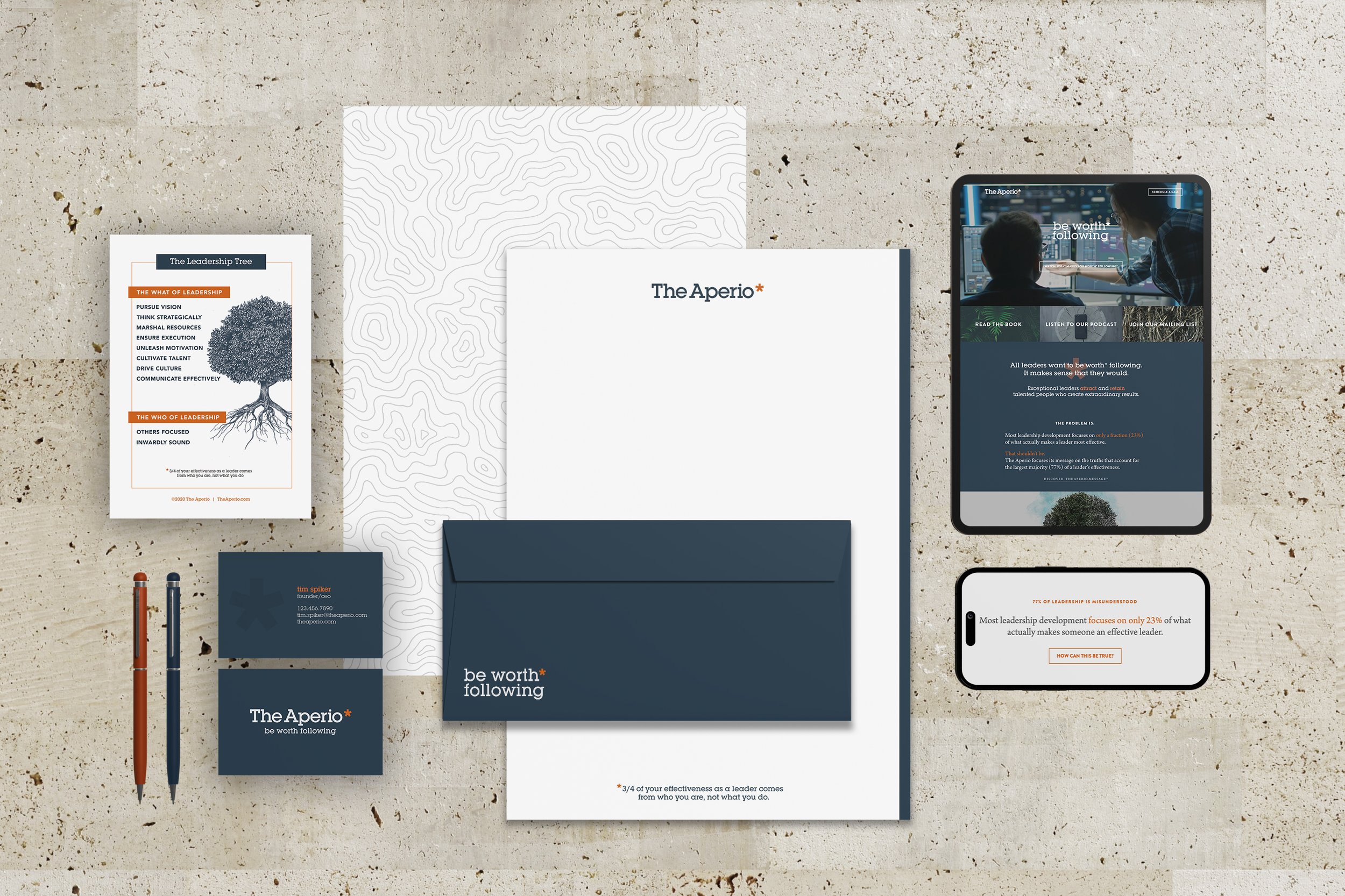
The Design System
With “the 77%” as the heartbeat, we redesigned the brand from the ground up:
Logo & Type: Stable, substantial, professional.
Color Palette: Harsh orange softened into a warmer, more sophisticated tone while keeping the distinctive blue/orange balance.
Domain: From the hard-to-spell Aperio to the memorable BeWorthFollowing.org.
The visual system wasn’t decoration — it was definition.


Pulling The Tread
For those who like all the details of the project.
The Challenge
The Aperio had a powerful research insight, but the brand wasn’t telling that story.
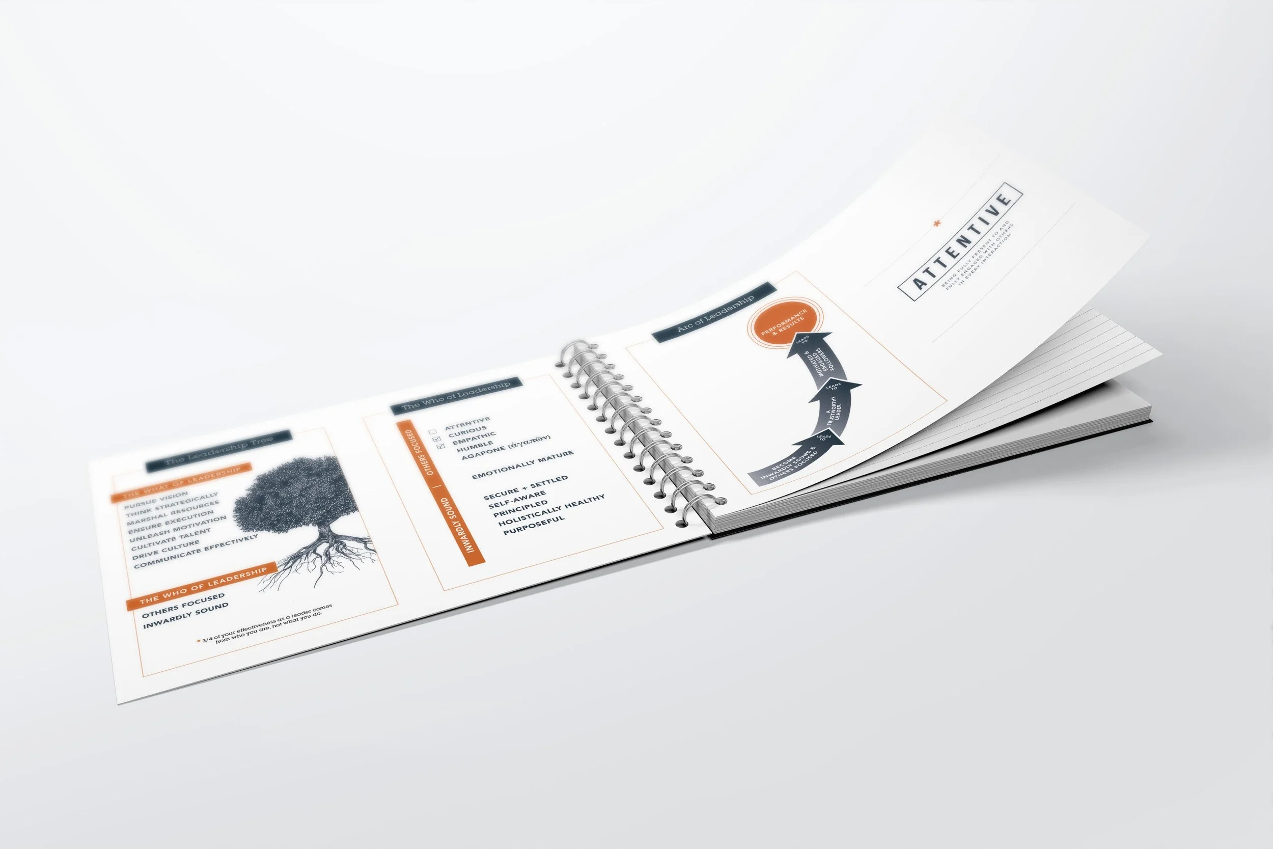
The tagline at the time — “better leaders, better results, better lives” — felt broad and generic. It didn’t capture founder Tim Spiker’s key discovery: being inwardly sound and others-focused accounts for 77% of leadership effectiveness.
The brand needed a sharper voice, a more professional presence, and a way to make worth feel concrete for senior executives who were investing in transformation.
The Creative Shift
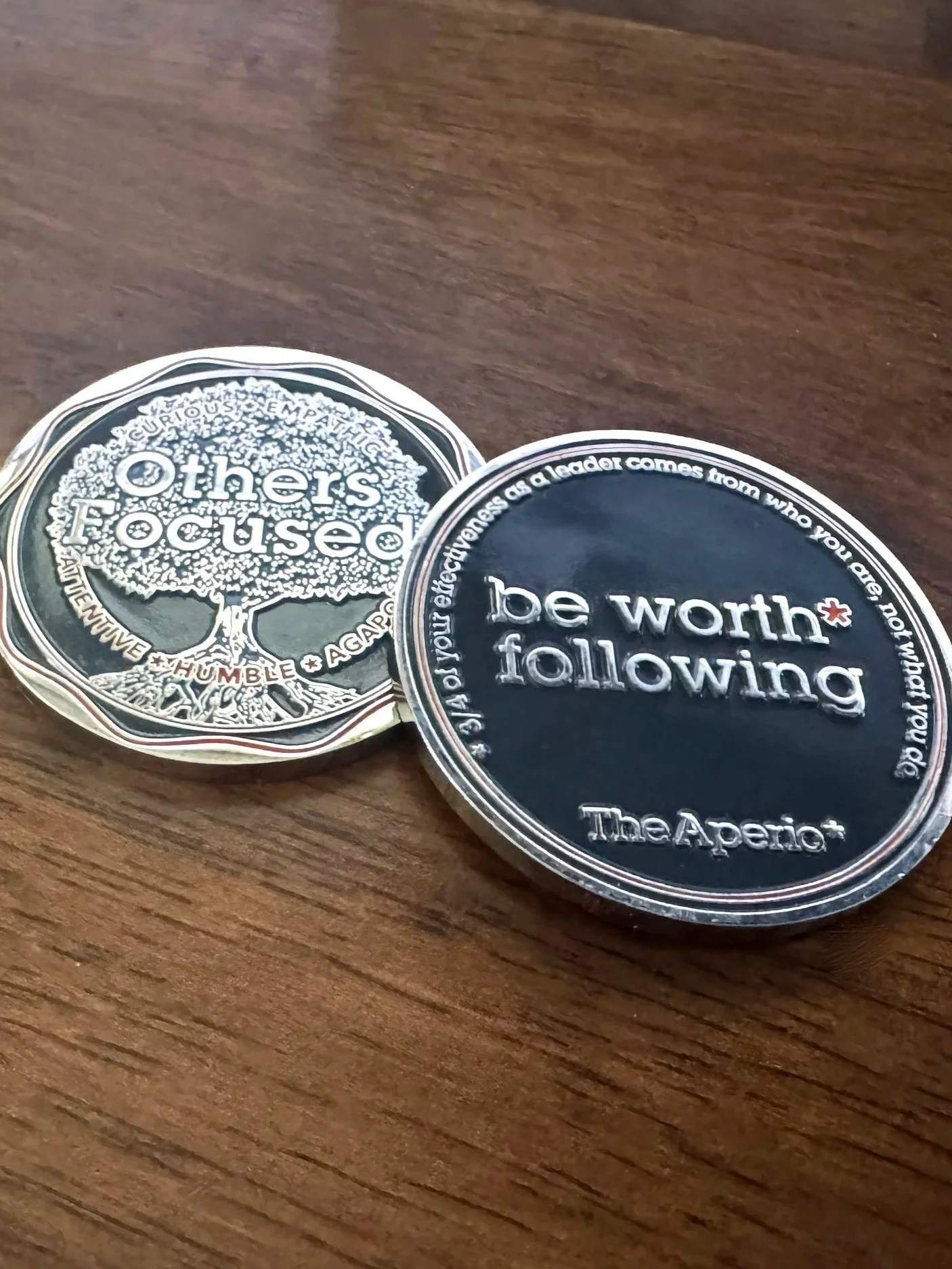
We centered everything on a single idea: be worth* following.
The asterisk became the brand’s defining symbol — a subtle footnote that carried the hidden truth.
It pointed to the research.
It gave worth real meaning.
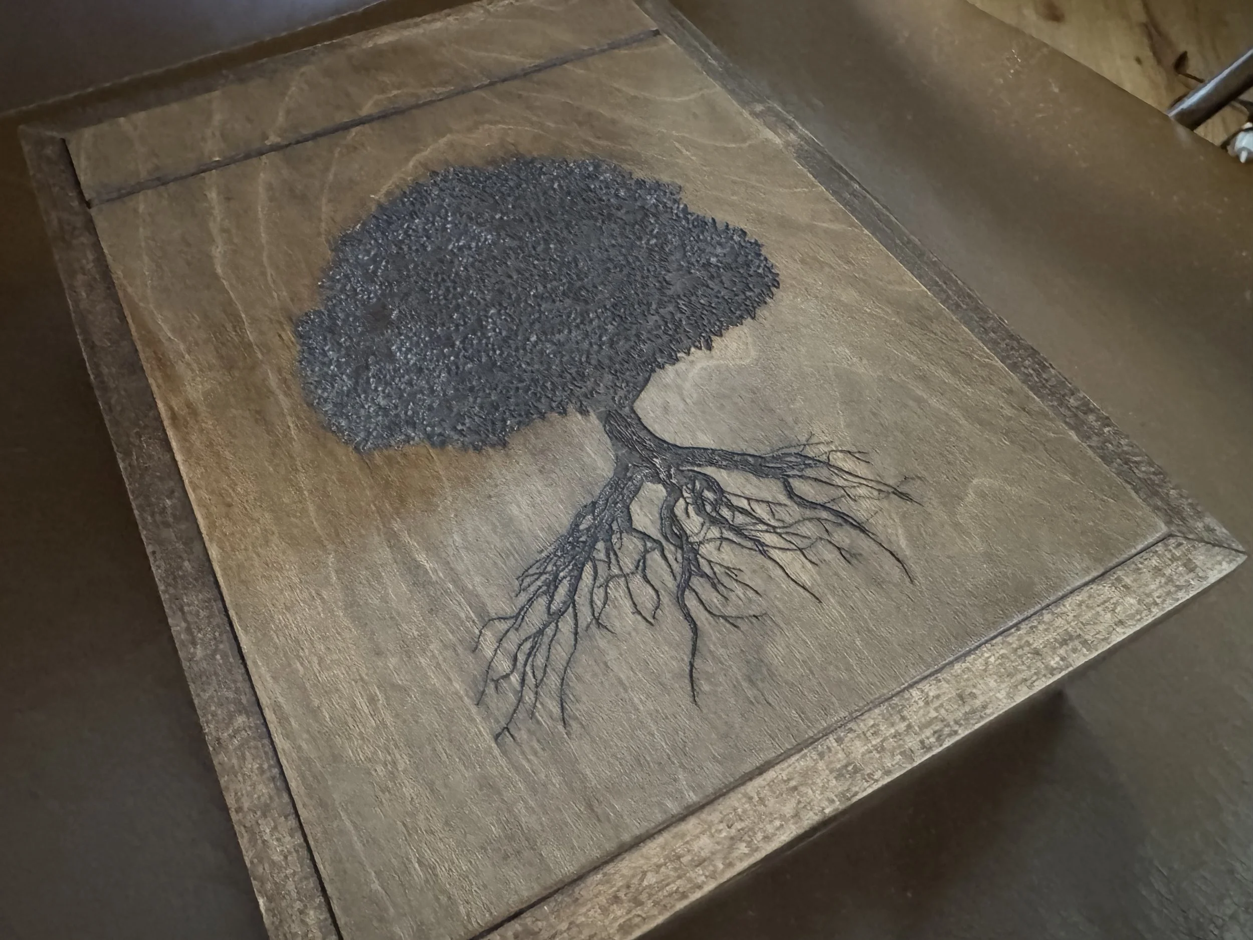
It honored continuity with the old “thriving person” icon while elevating the entire look and feel.
The new identity replaced abstraction with clarity, and turned a vague promise into a standard.
The Experience
Because the audience included high-level executives, every touchpoint had to feel intentional.
Physical artifacts: Custom leather notebooks (sourced internationally), U.S.-made wood boxes, and display cards designed to last.
Cost-effective printing techniques that delivered a premium feel without breaking budget.
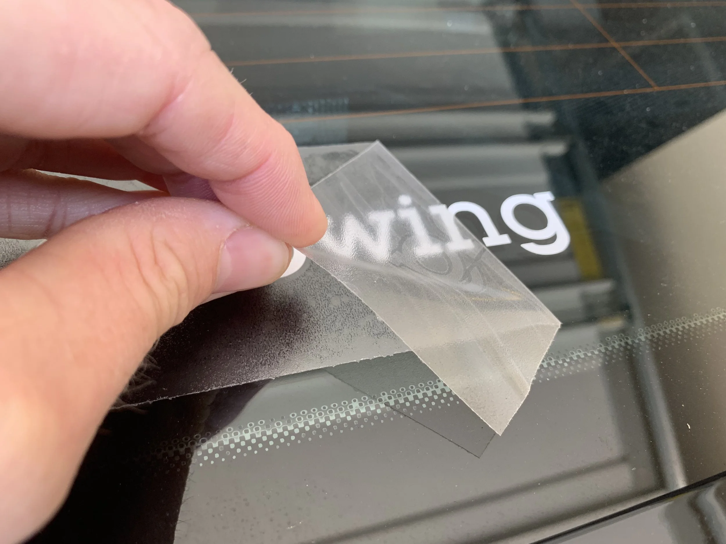
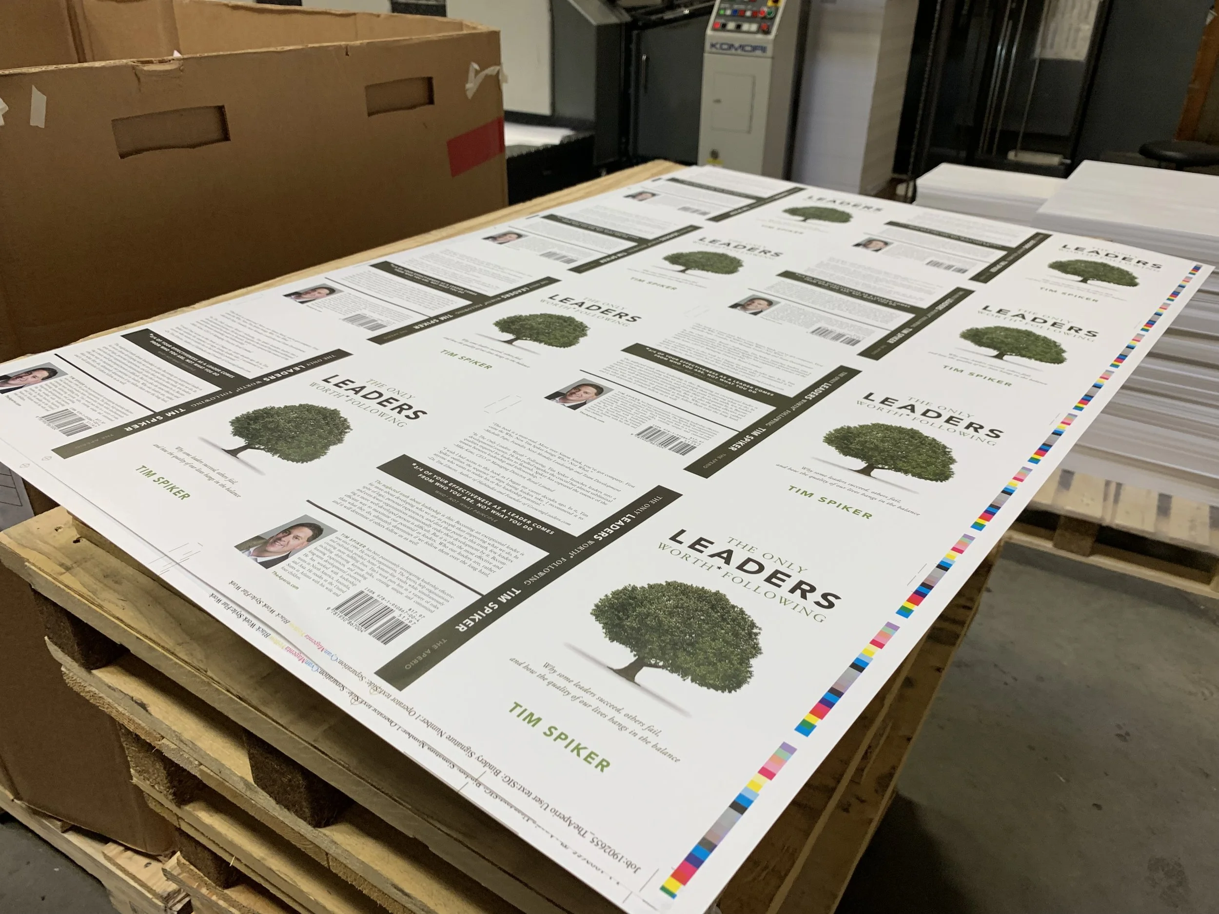
Book design & production: Aligning Tim Spiker’s long-awaited book with the refreshed identity, ensuring consistency and credibility.
Every detail became a tangible extension of the brand’s new clarity.
The Outcome
The rebrand positioned The Aperio with:
A focused identity anchored in its most transformative insight.
Elevated client experience that matched the investment senior leaders were making.
A stronger sense of internal confidence that celebrated the story at the heart of the work.
The asterisk is no longer decoration. It’s the fine print of great leadership — the standard that sets this brand apart.