
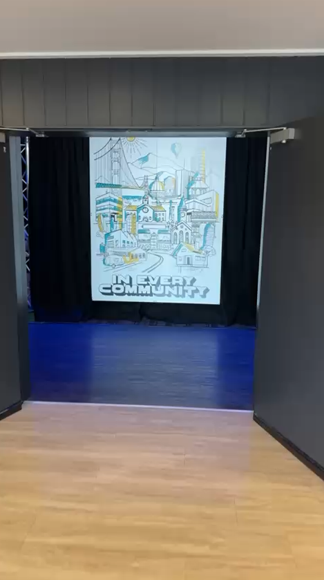
In Every Community
Rally Cry: A Brand That Belongs to Everyone
This wasn’t about designing a logo or even a website. It was about creating a shared identity — something leaders, volunteers, and whole communities could take home, wear proudly, and make their own—a bit like redesigning a nation’s flag.
Various churches had already joined this network and were already part of something bigger—they just didn’t have a shared way to see it, name it, or show it.
The task wasn’t to introduce change, but to invite ownership—to turn what felt new into something that felt like theirs.
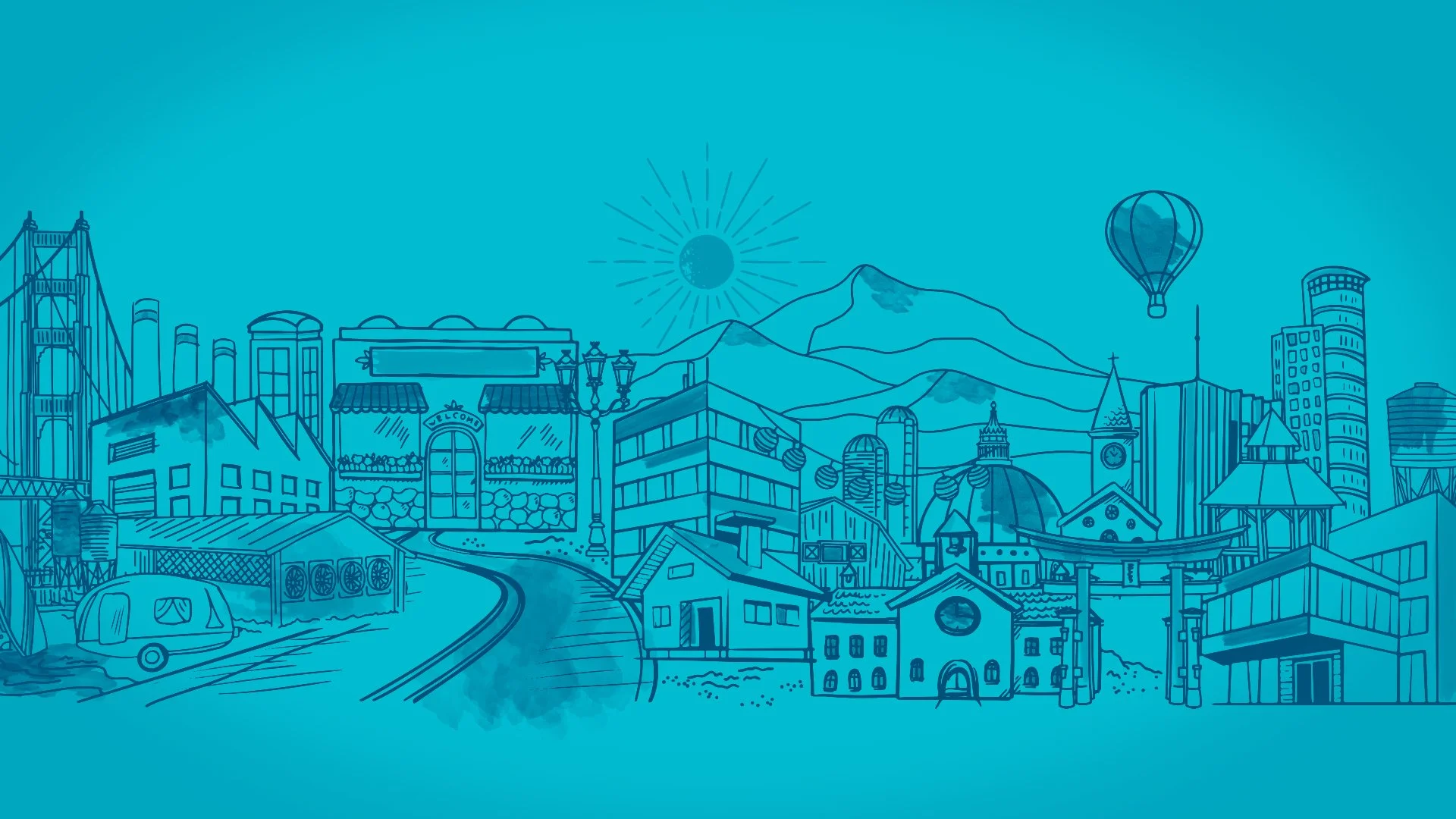
Handmade, human, and a little unexpected, the brand became more than visuals. It became a rally cry — a badge of belonging that could travel from conference halls to coffee shops, from big cities to small towns, reshaped by every community it touched.
CREATIVE DIRECTION | BRAND AFFINITY DESIGN | BRAND EXPRESSION

What Made It Work
Elements that helped the project land.
Movement Identity
Building a brand flexible enough to belong to every local church, yet unified enough to inspire nationally.
Badge of Belonging
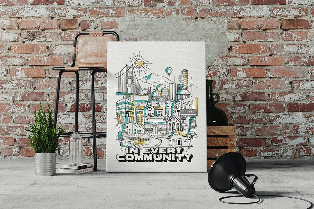
Creating merch, books, and digital tools that people were proud to wear, share, and display.
Shared Ownership
Engaging leaders as co-creators—so the brand wasn’t something handed down, but something they helped carry forward.


Project Highlight
The unique challenge of this project—earning true stakeholder ownership rather than simple buy-in—required innovative steps. Two were especially critical:
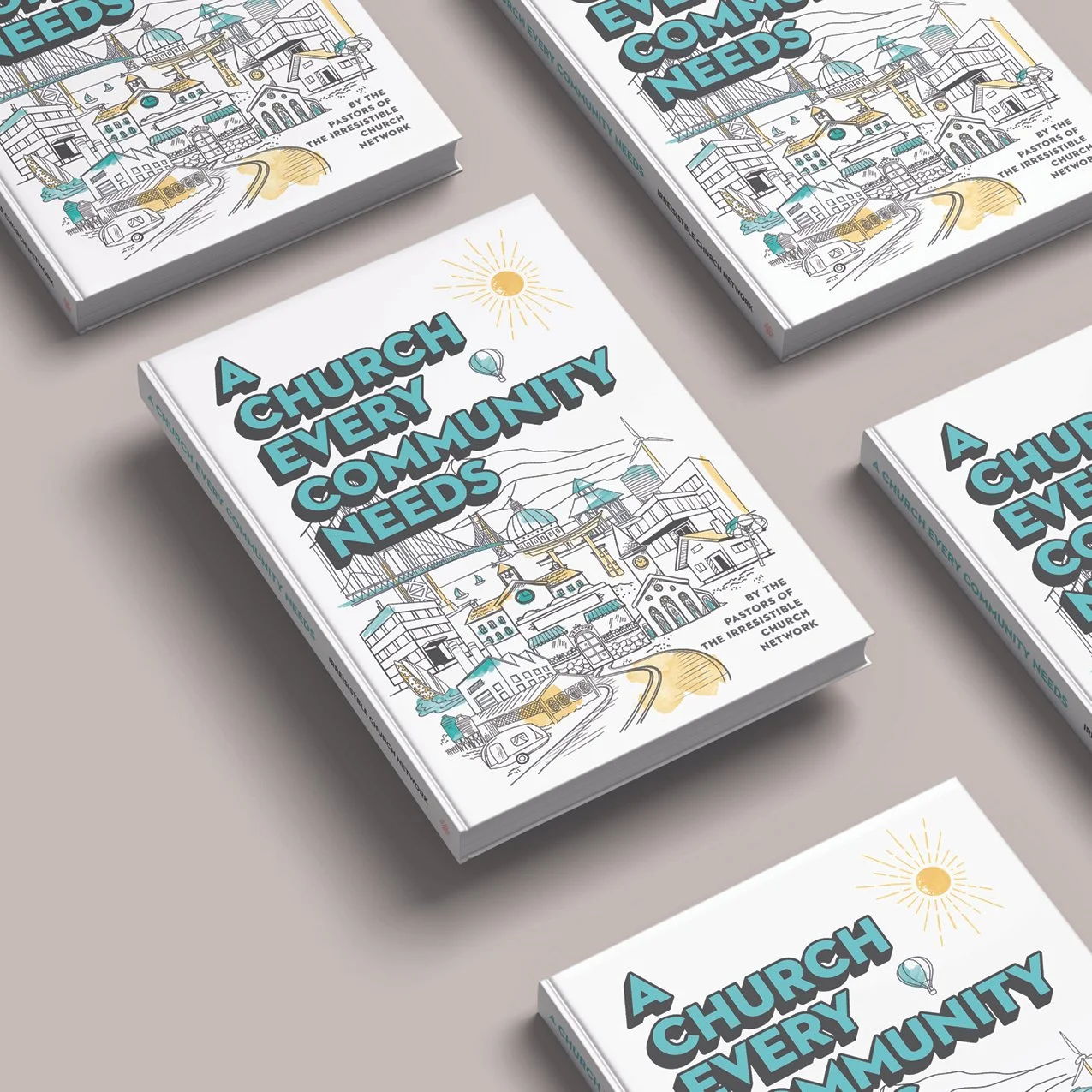
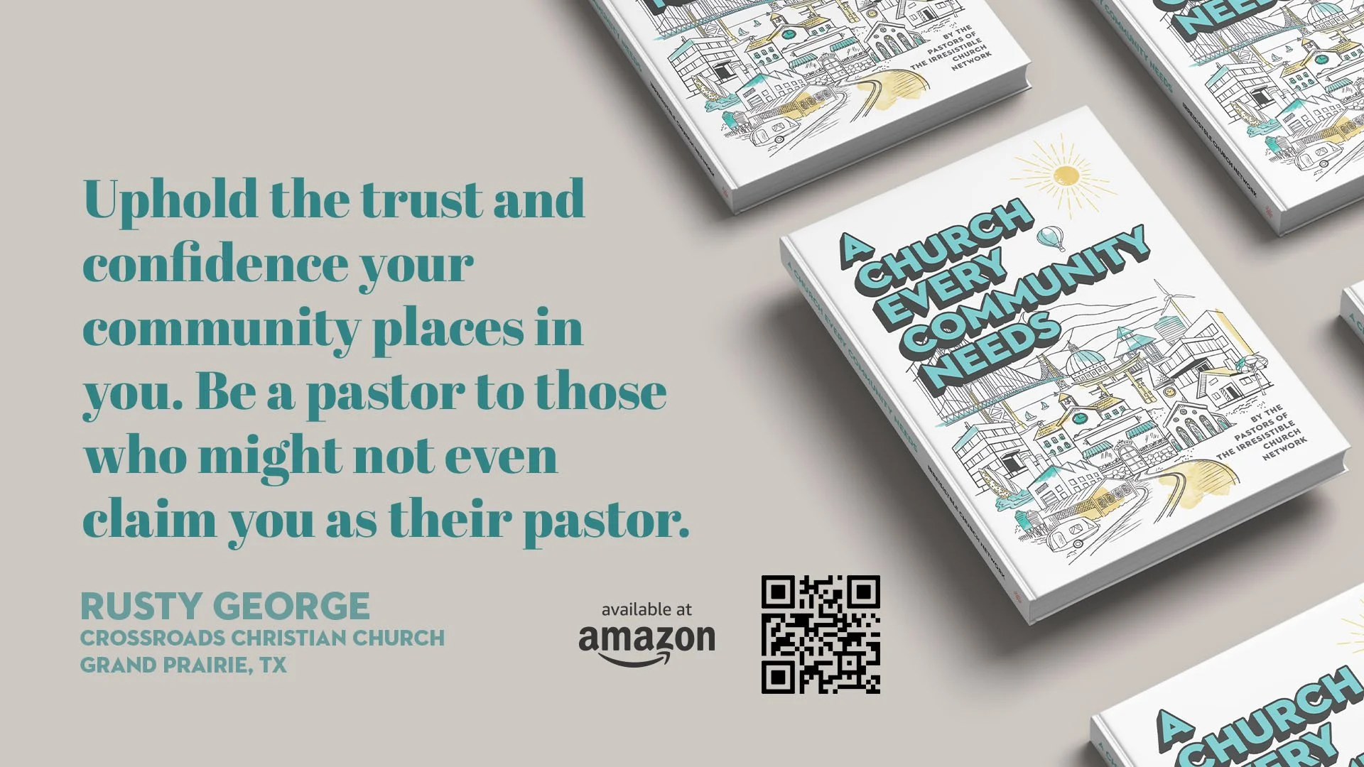
Collaborative Book: A resource authored by sixteen leaders from within the movement, articulating its vision and values in their own words. The book became both definition and declaration—a way to understand the movement from the inside out.
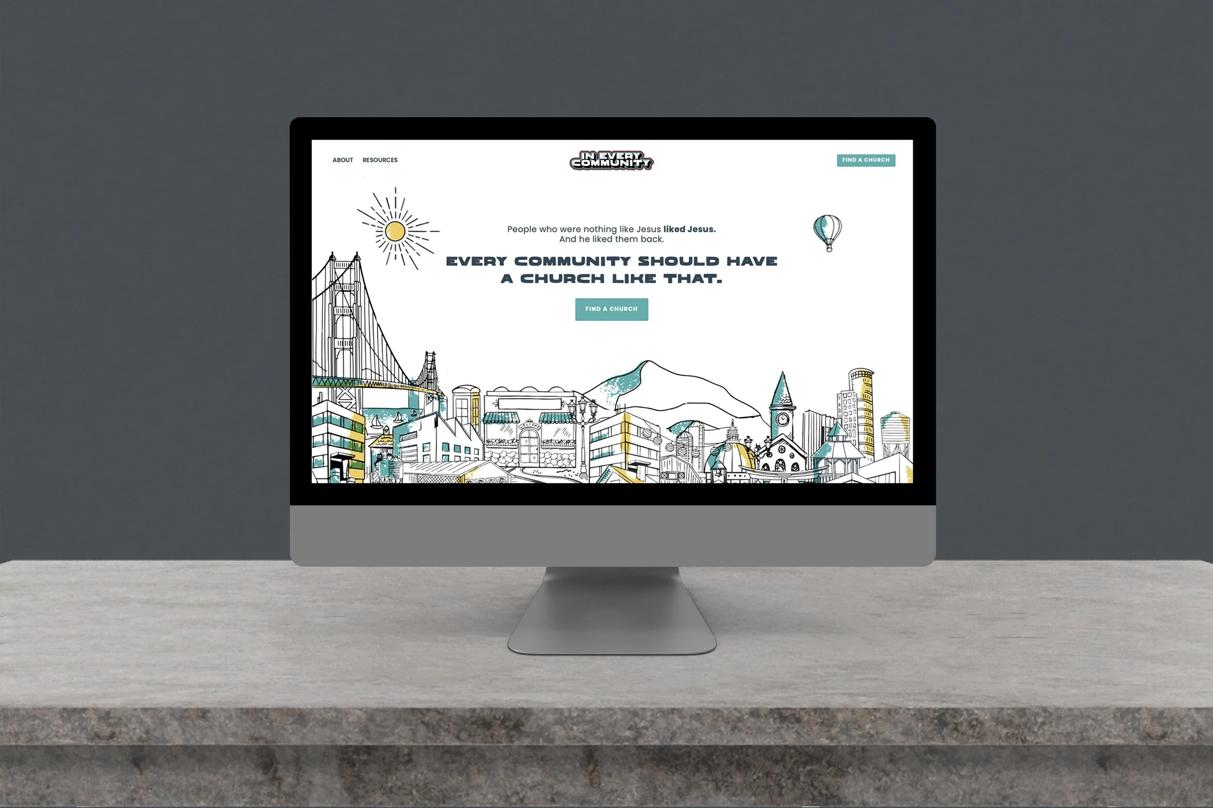
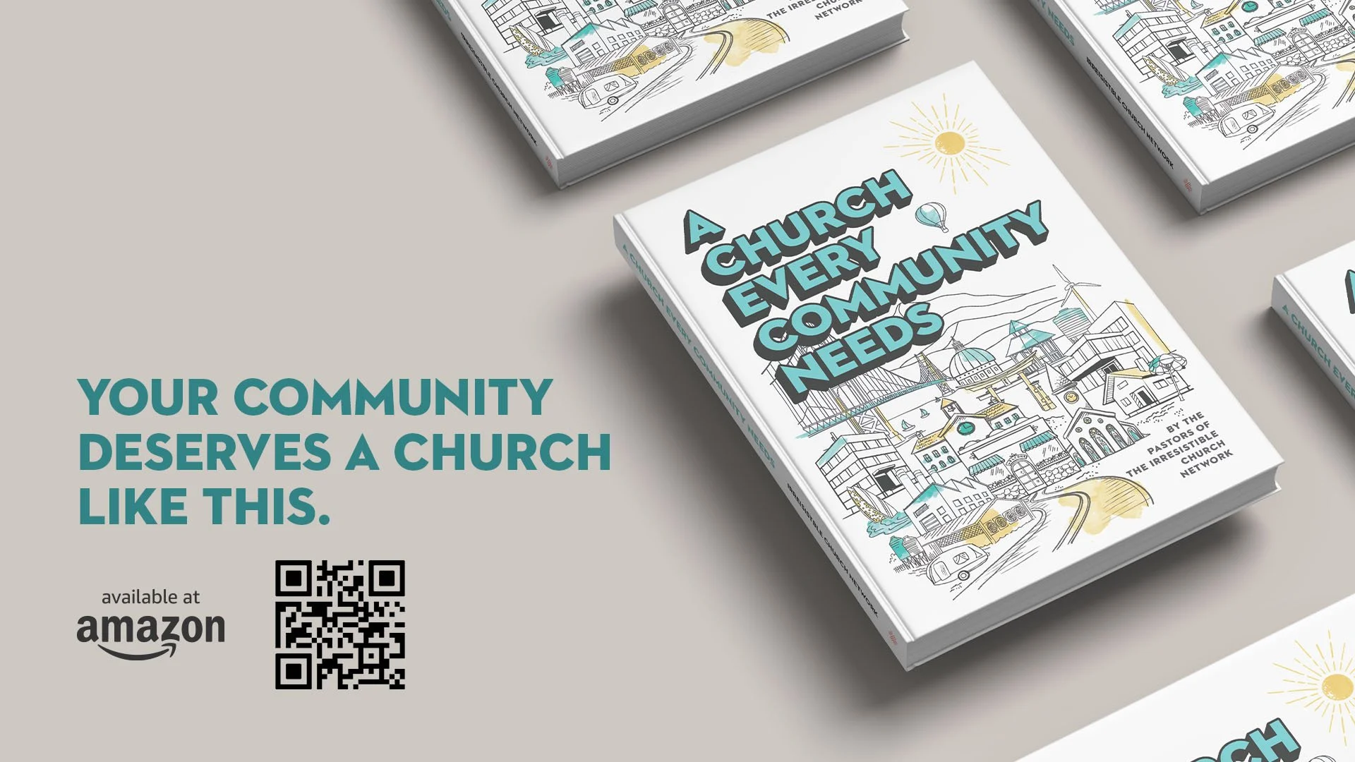
Public Website: A clear, accessible platform where people searching for this kind of church could find aligned communities—both within and beyond the official network—and see, in plain language, the kind of church the movement aspired to be.


Pulling The Tread
For those who like all the details of the project.
The Challenge
The vision was clear: help a growing network of churches see themselves as part of one movement.
But unity can’t be forced—it has to be felt.
These leaders already shared values and instincts; what they lacked was a visible center to gather around. The challenge was to design something strong enough to unify, yet open enough to invite co-ownership.
It couldn’t feel corporate, imposed, or “headquarters-made.” It had to feel discovered—like something they’d always believed, only now named and made tangible.
Defining the Core
Unique Value Proposition (UVP)
One of the hardest parts of this project wasn’t design — it was definition. These churches hadn’t rallied around a shared label or model. They found each other through word of mouth, through the quiet realization: we’re trying to do church the same way.
But what way was that?
Our challenge was to name it clearly enough that everyone could see themselves in it, without boxing it into familiar categories. Not attractional, not program-first, not built on polish — but community-first, people-first, presence-first.
The brand gave language and form to what had only been felt. It created a center everyone could gather around, a core that turned recognition into a movement.
The Creative Direction
At the heart of the brand was a question: What does it look like when a church puts people first?
The design direction answered with a visual language that felt handmade, quirky, and deeply human.
Illustration & Type: Partnered with an illustrator to create playful icons, custom typography, and warm tones that felt more like a neighborhood boutique than an institution.
Scalable System: The identity was designed to flex — from local chapter variations to national conferences — so churches could adopt and adapt it as their own.
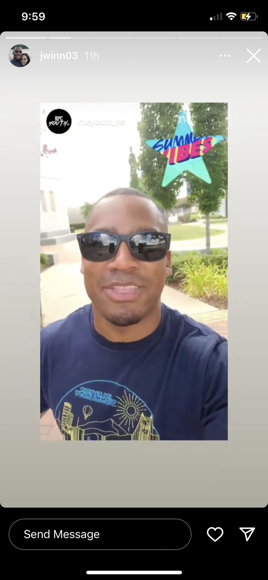
Merch & Materials: Tote bags, tees, pens, buttons, and signage weren’t afterthoughts; they were intentional touchpoints to spread the movement outward.
Editorial Anchor: To solidify the vision, I originated and led the collaborative book A Church Every Community Needs — curating authors, shaping content, and editing the work into a lasting resource that captured the heart of the movement.
The Experience
The identity came alive everywhere:
Conferences: Attendees sought out the materials, eager to take something home that carried the message.
Local Churches: Pastors reformatted and reimagined the assets to fit their own contexts, proving the system could stretch without breaking.
Online Presence: A dedicated website helped people find churches aligned with the vision — whether moving, graduating, or searching.
The brand wasn’t static. It was iterative, enduring, and expansive — able to belong wherever it was picked up.
The Outcome
You know something works when it takes on a life of its own. Churches who just took the brand and used it (asked permission later 😉)
The outcome was a brand that became more than a look — it became a badge of belonging.
Attendees wore and shared the identity as their own.
Pastors handed out the book as a resource to shape culture and cast vision.
People across the country used the website to find churches that reflected their values.
By designing something wearable, adaptable, and deeply human, the brand didn’t just represent a movement — it fueled one.