
The Parish
Whispering Tradition Into Something New
The Parish wasn’t a redesign. It was a beginning.
A brand-new Anglican church plant needed an identity that could carry both its newness and its roots — connecting to centuries of Christian tradition while creating something fresh, local, and approachable.
The vision was to form a neighborhood parish: small, rooted, communal. A place where ancient practices and modern lives meet, where people could feel at home while being invited into something deeper. The design had to hold all of that — not loudly, but with quiet strength.
CREATIVE DIRECTION | BRAND IDENTITY | DESIGN EXECUTION


What Made It Work
Elements that helped the project land.
Tension of Ancient & New
Creating an identity rooted in historic faith while feeling modern and accessible.
Community Scale
Designing a brand that communicated “small and simple” — built to plant more parishes, not grow bigger.
Multi-Use Simplicity
Building a system easy for a small staff to carry across liturgy guides, signage, and digital touchpoints.


Pulling The Tread
For those who like all the details of the project.
The Challenge
The Parish was entirely new, yet it couldn’t feel disconnected from the old.
This church also carried a unique conviction: it would always be small and simple. If the community grew beyond its space, the answer wouldn’t be to expand but to plant another parish — keeping each one rooted in its neighborhood, close-knit, and relational.
The identity needed to communicate that posture to newcomers from the start. This wasn’t about size or polish. It was about community-first design, reflecting the humility and intimacy of the old parish model.
The task was to create an identity that:
Felt sacred but not inaccessible.
Drew on history without looking antiquated.
Signaled smallness, simplicity, and community.
Could be carried forward easily with limited staff and resources.
In other words, the design needed to whisper — not shout
The Creative Process
I set out to design a visual system that embodied the tension of ancient and new.
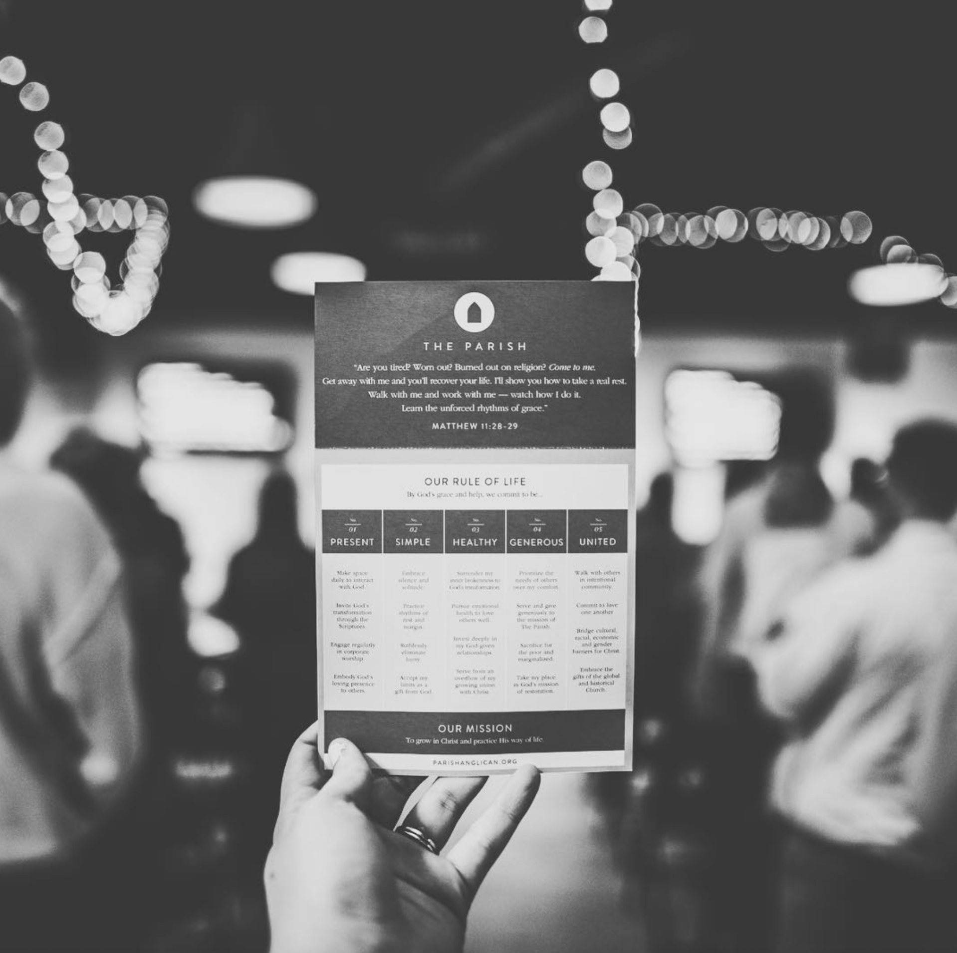
Symbol: A circular mark that suggested many things at once — the intimacy of a small community, the form of a Gothic church window, a keyhole, and a doorway into sacred space. It was rooted in tradition but softened for accessibility.
Typography: Paired the symbol with Brandon Grotesque, a clean sans serif that kept the brand approachable and modern.
Minimalist System: The look was intentionally restrained — built on whitespace, simplicity, and authenticity over polish. This ensured the identity could work seamlessly on everything from digital assets to print materials.
Practical Guidelines: Because the church had limited staff, I created brand guidelines and trained the team in simple design principles — teaching them to embrace whitespace, avoid clutter, and use authenticity as their design standard.
This was pure design work — balancing history, community, and usability into something small teams could carry forward.
The Experience
The brand wasn’t designed for a single moment — it was designed for continued use.
Churches rely on their visual identity across countless touchpoints: liturgy guides, bulletins, signage, sermon slides, invite cards, websites, social media, even community events. For a small staff without in-house design, the system had to be multi-use, flexible, and simple to carry forward.
Because the aesthetic was restrained and minimalist, it translated easily across:
Print: service guides, postcards, neighborhood invites.
Digital: website, social media, sermon graphics.
Physical: signage, volunteer materials, environmental graphics.
The symbol and guidelines gave the church a visual consistency that would last, not just for launch, but for the ongoing rhythm of parish life.
The Outcome
The final brand is visually quiet but deeply resonant.
It feels sacred yet modern, rooted yet inviting.
It reflects the church’s DNA: small, simple, community-first, never aiming to grow big but always ready to plant new parishes when needed.
The launch team embraced it fully, and the local community immediately recognized themselves in it.
The brand continues to scale easily across digital and print, sustained by the team’s own efforts without the need for ongoing outside design support.
Most importantly, it reflects the heart of the church itself: ancient practices, renewed for today, in the middle of a real community.