
Starting Point
When the Questions Matter More Than the Answers
Starting Point had grown beyond its origins as a structured teaching program.
What people were really coming for wasn’t a curriculum — it was a safe place to ask the questions they weren’t sure they could ask anywhere else.
The rebrand emphasized that shift: questions weren’t problems to fix, but invitations to meaningful conversation. The identity moved from classroom to living room — warmer, more human, and designed to feel like a true beginning, not a lecture.
CREATIVE DIRECTION | PRINT DESIGN | PHOTOGRAPHY SOURCING | BRANDING
What Made It Work
Elements that helped the project land.
Strategic Insight
Anchoring the rebrand around conversation as the true “starting point.”
Human Mission
Creating an inclusive, invitational tone where doubt and curiosity felt welcome.
Durability
Materials still in active use today, with global adoption and continued impact.
Before


Pulling The Tread
For those who like all the details of the project.
Project Goal
What began as a structured teaching environment had evolved into something more conversational and community-driven. The rebrand needed to reflect that shift: from instruction to invitation, from “learning about” to “talking through.”
The Creative Shift
The breakthrough insight came in a single question: What are people starting? The answer wasn’t a class or a course. It was a conversation. That idea became the organizing principle for the brand.
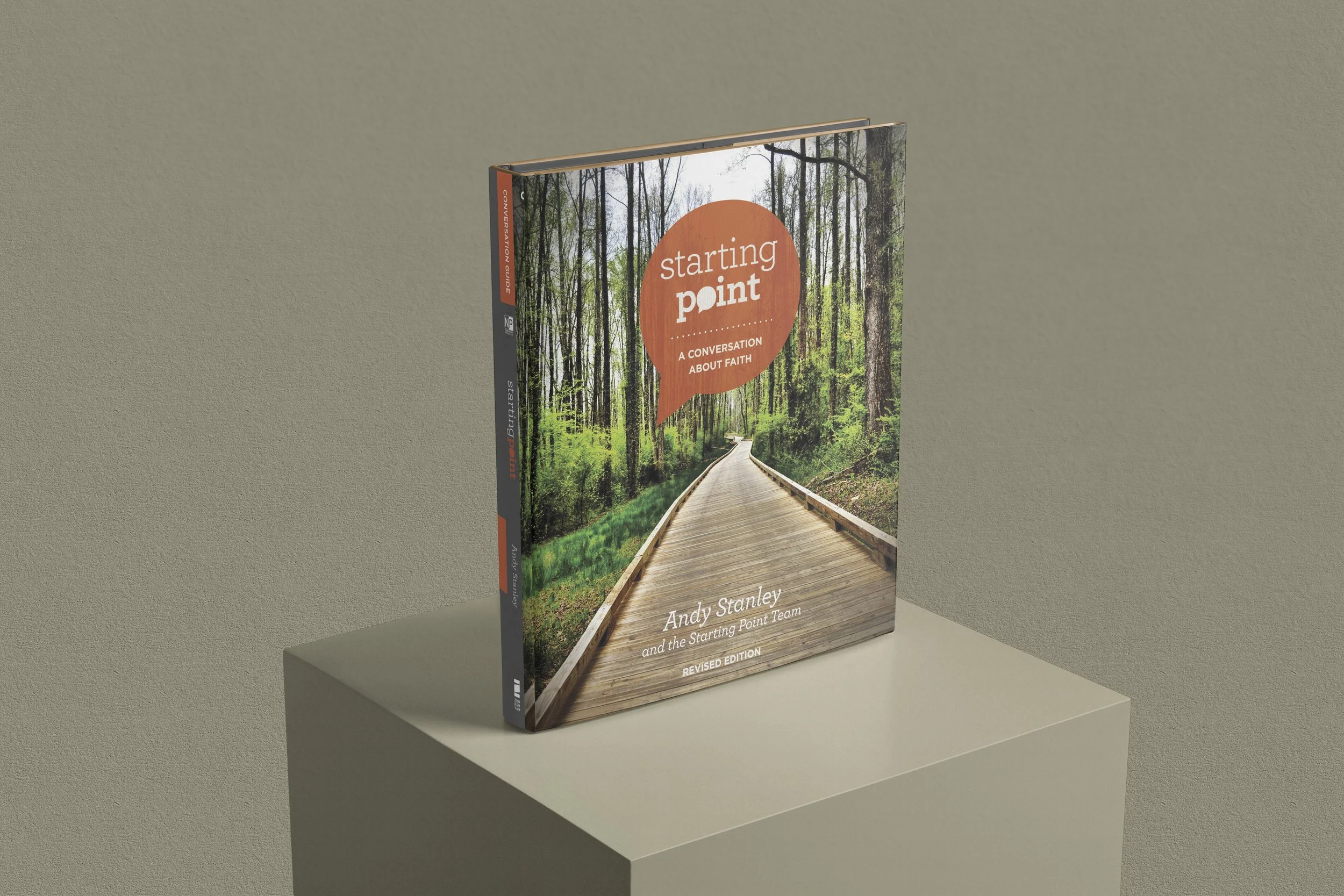
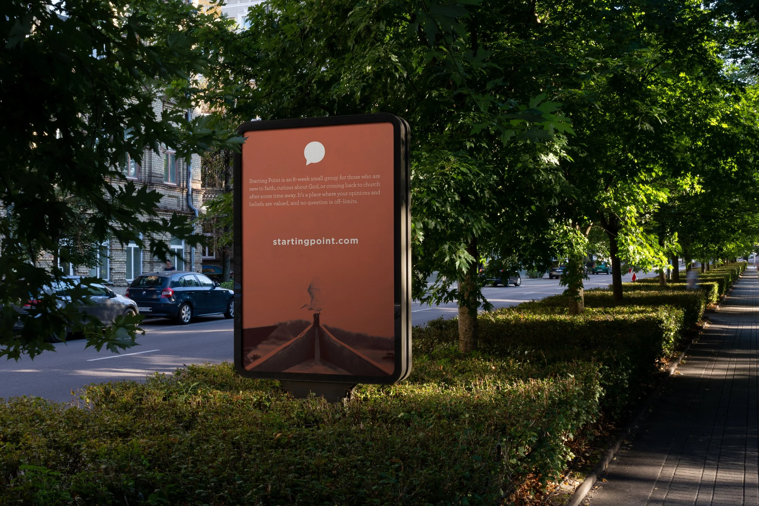
Positioning & Tagline: “Some questions have answers. Others deserve a conversation.” A line that communicates safety, openness, and curiosity.
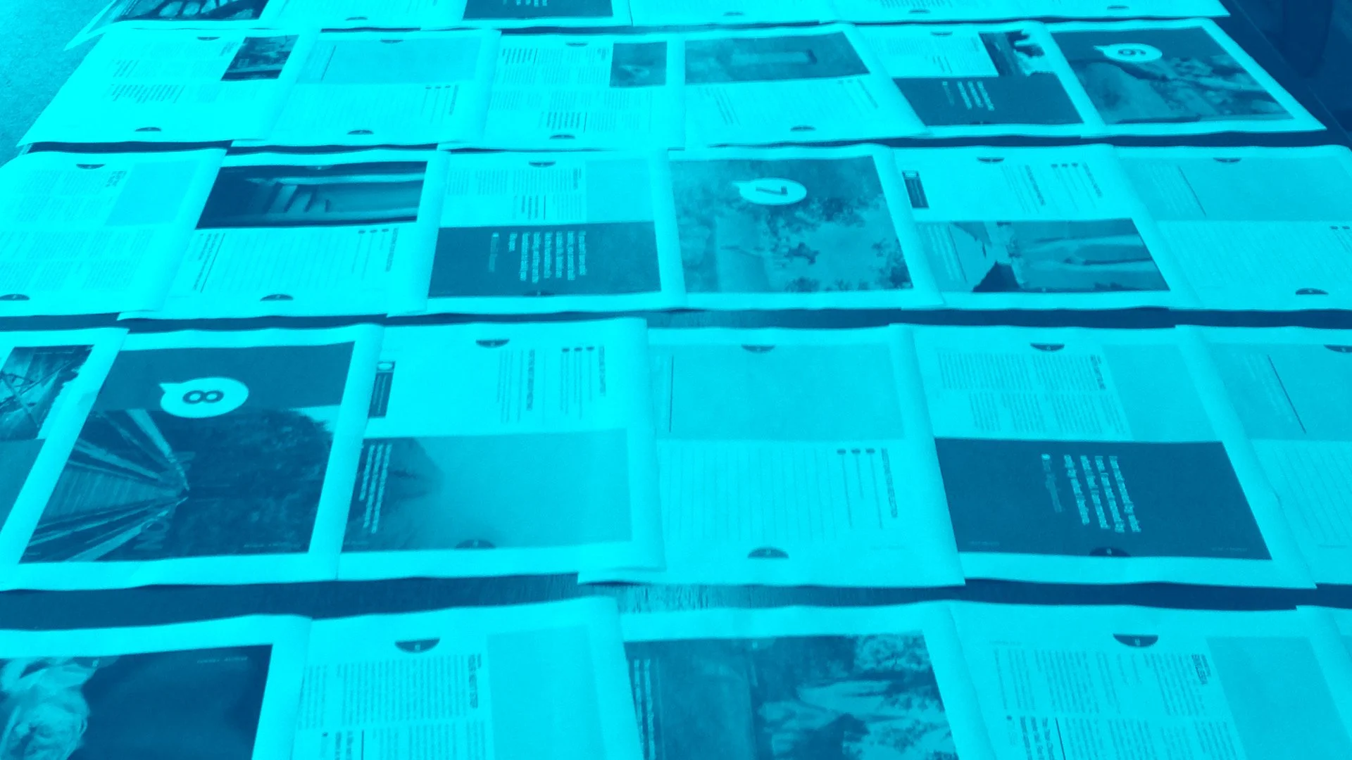
Design Approach: We reimagined the materials as a gift — something participants would want to keep, revisit, and share.
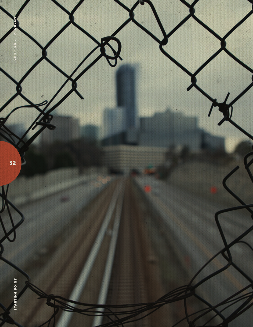
Visuals: Moved away from polished stock imagery toward genuine lifestyle photography that evoked warmth and authenticity.
Tone: Layered in thought-provoking quotes from diverse voices across the faith spectrum, modeling the inclusivity of the experience.
The Experience
Because the audience included high-level executives, every touchpoint had to feel intentional.
Physical artifacts: Custom leather notebooks (sourced internationally), U.S.-made wood boxes, and display cards designed to last.
Cost-effective printing techniques that delivered a premium feel without breaking budget.
Book design & production: Aligning Tim Spiker’s long-awaited book with the refreshed identity, ensuring consistency and credibility.
Every detail became a tangible extension of the brand’s new clarity.
The Outcome
The new Starting Point brand launched with a cohesive system of visuals, language, and participant materials that captured the heart of the experience.
· Picked up for national distribution by HarperCollins.
· Adopted by churches worldwide, with translations into multiple languages.
· Continues to be a flagship environment for people beginning honest conversations about faith.
The redesign didn’t just update the look — it reframed the program’s purpose. By centering conversation instead of curriculum, Starting Point became a more human, invitational, and enduring experience.