
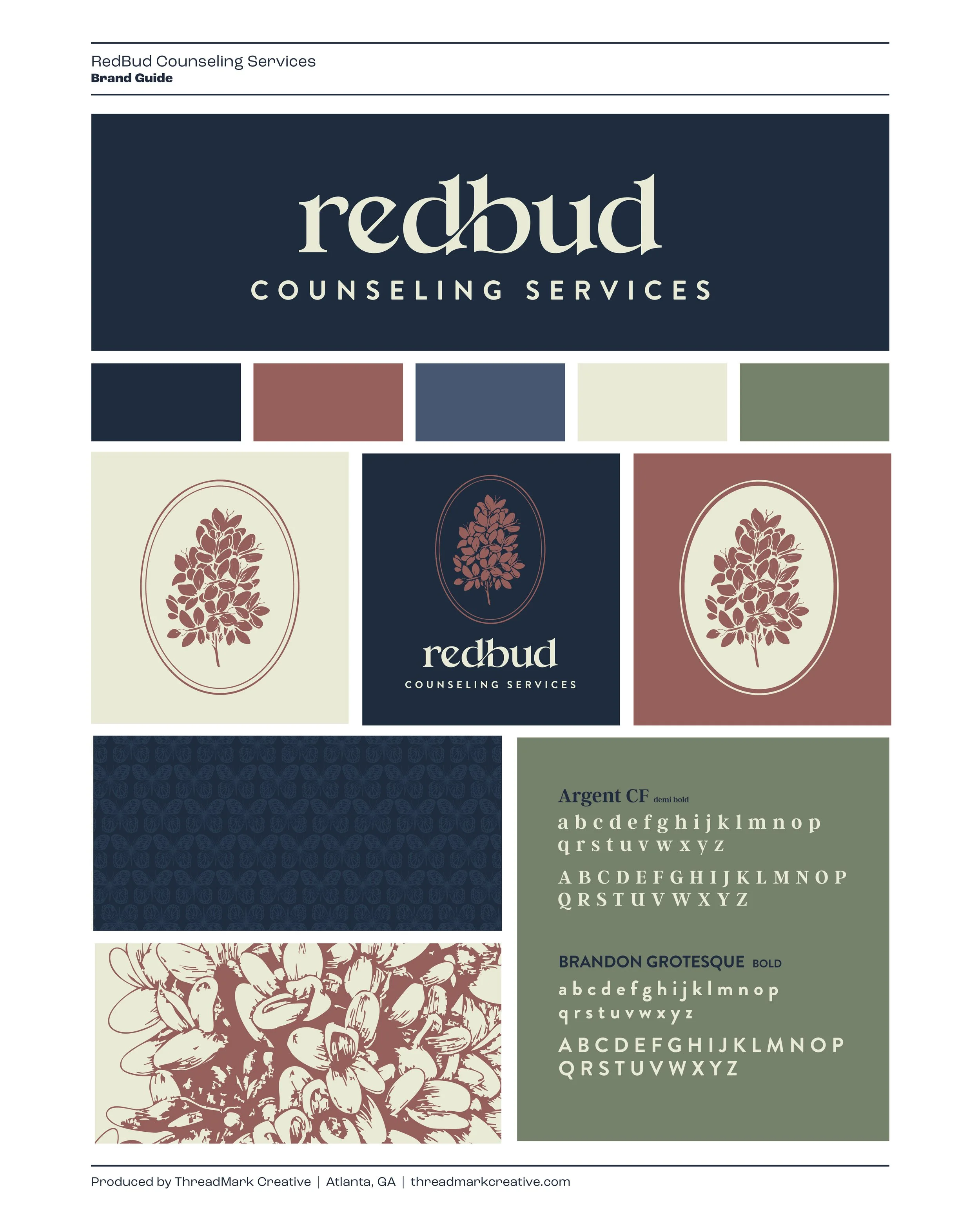
RedBud Counseling
A Name Filled with Meaning
RedBud already had a name with weight.
The client’s connection to redbud trees and butterflies wasn’t marketing. It was personal — the kind of meaning you don’t want to over-explain, but you can’t ignore either.
The design problem was clear:
Build an identity that honors the story without putting the story on display.
Combine two symbols (redbud + butterflies) without making the mark feel busy, literal, or precious.
Keep it warm and approachable, but still credible — something that feels like a real practice, not a template.
BRAND IDENTITY | WEB DESIGN | ILLUSTRATION

What Made It Work
Elements that helped the project land.
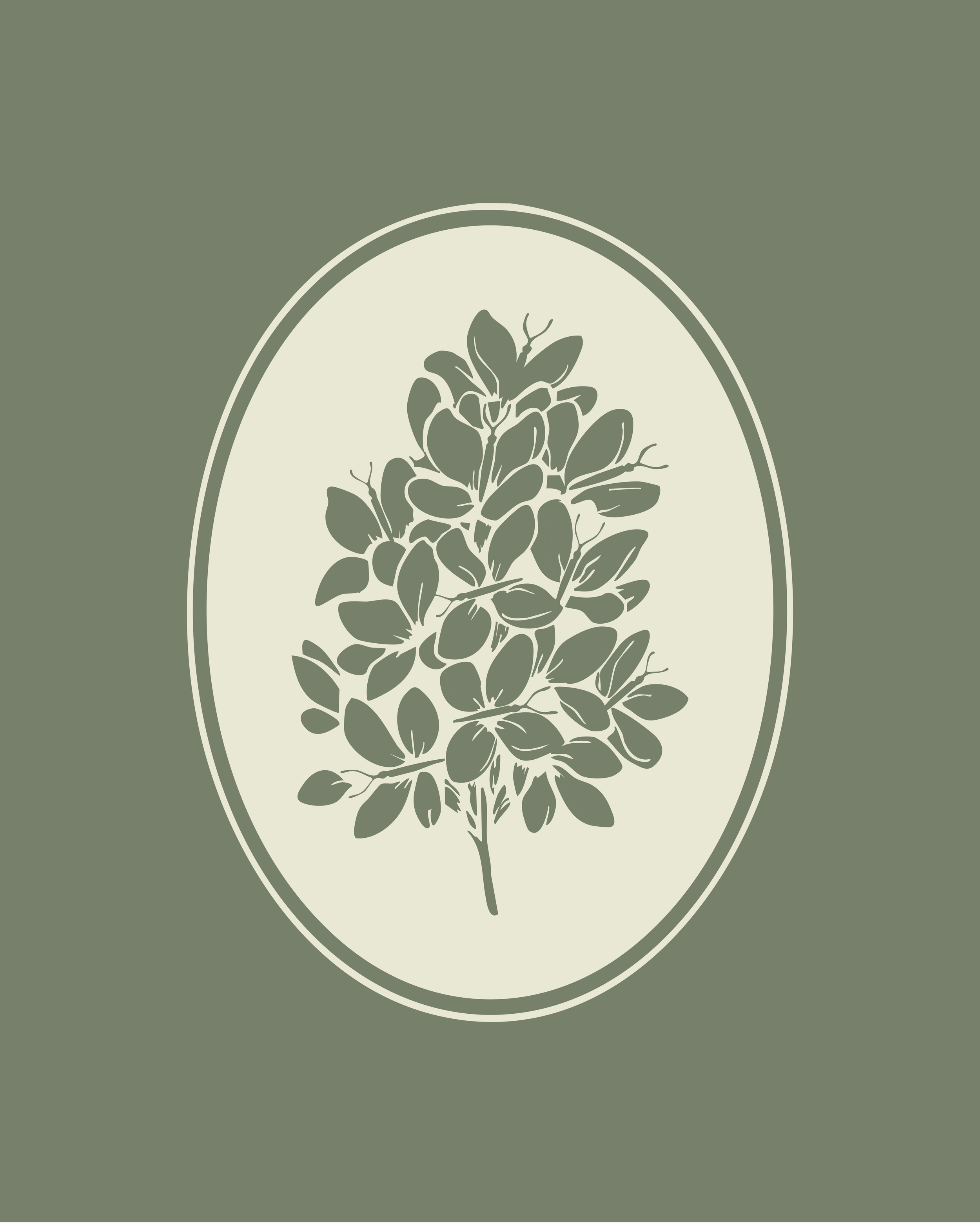
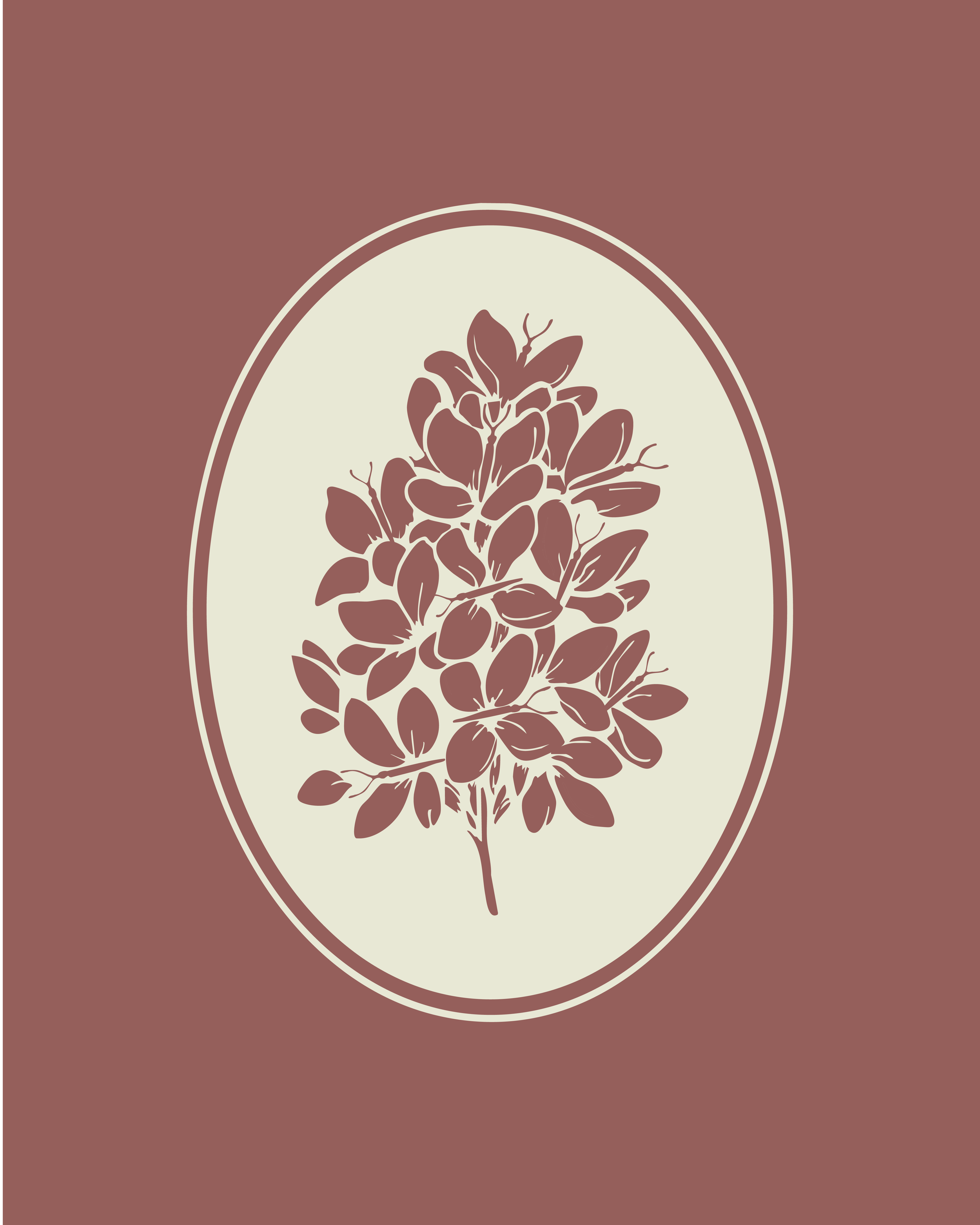
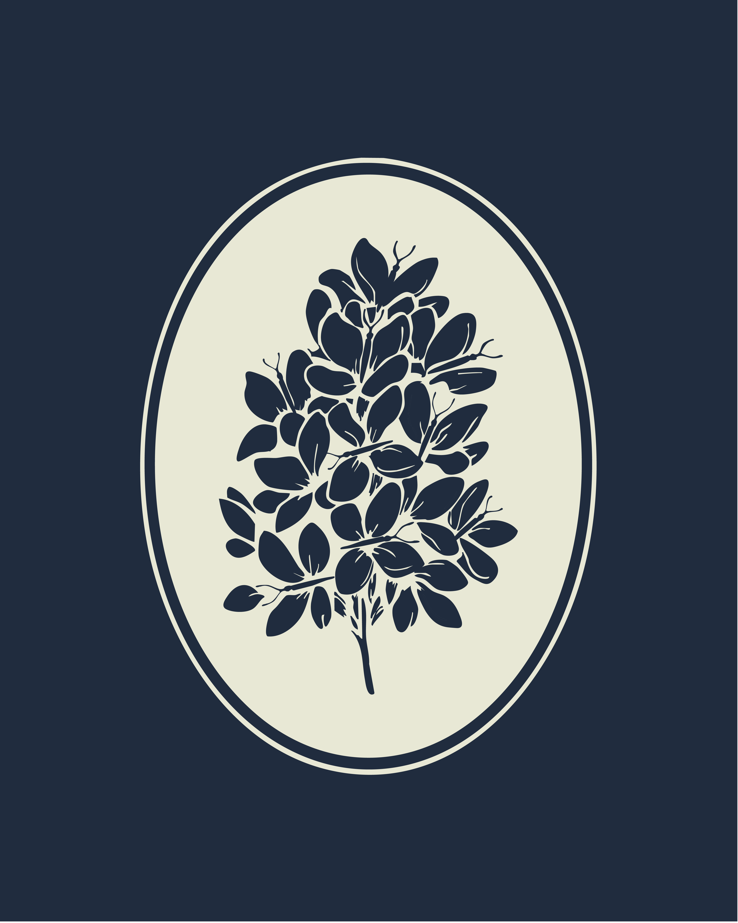
2-in-1 Mark
Instead of layering butterflies onto a tree (the obvious, cluttered route), I found the overlap: a simplified redbud blossom that also reads as butterflies. One drawing. Two meanings. Clean at every size.
Personal Story into a Professional System
The meaning stayed intact, but the brand didn’t become a biography. The symbolism lives in the work — not in an explanation — so the identity feels warm and human while still reading as credible care.
Hand-Tuned Details
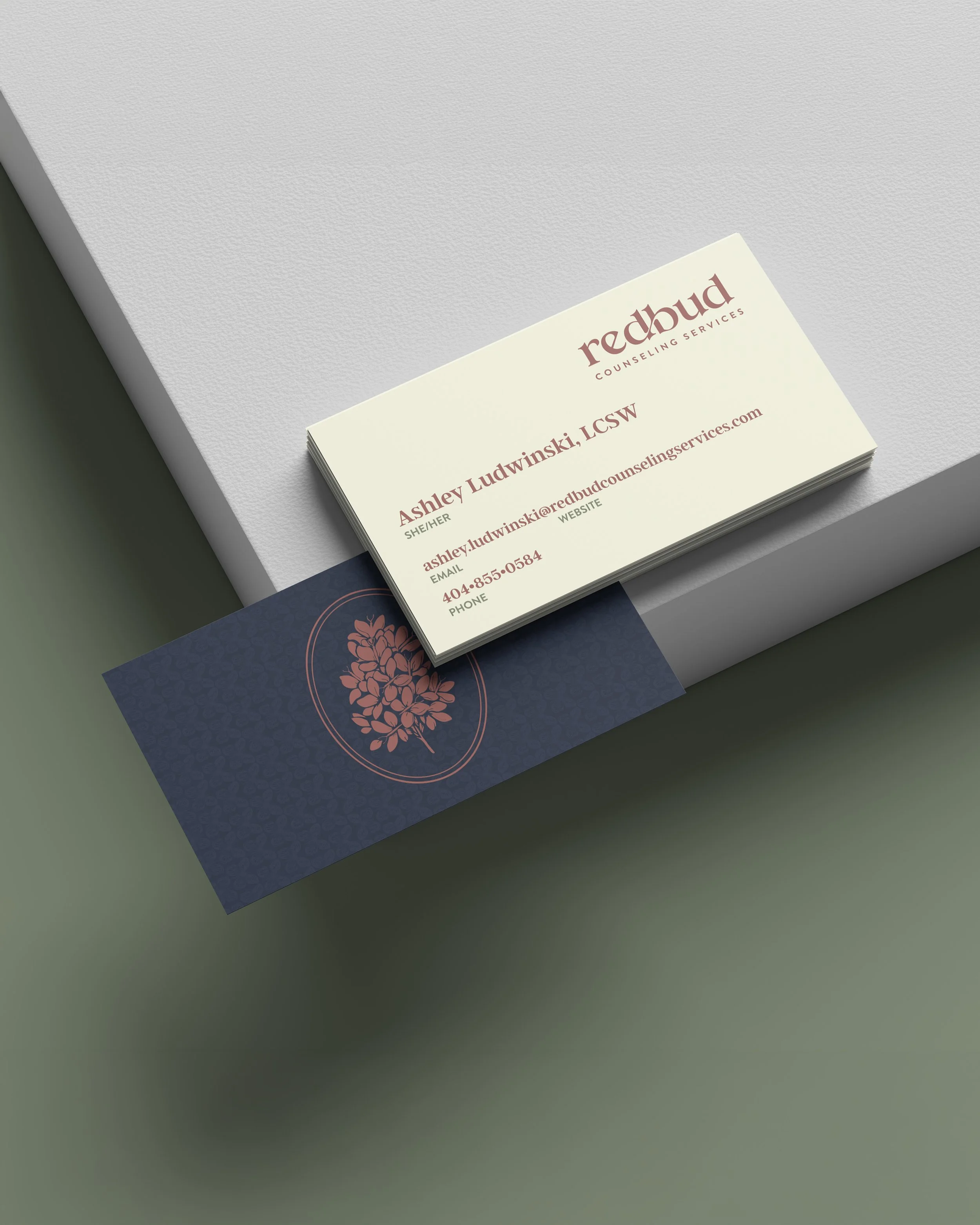
The illustration was refined for clarity and balance, and the typography was modified from an existing font so “RedBud” feels organic and connected (not picked from a menu). That craftsmanship is what makes the whole thing feel real.

The Details
The Design System
A few choices made the system feel real (and usable), not just “pretty.”
Illustration
The core illustration does the heavy lifting — organic, simple, and recognizable at a glance.
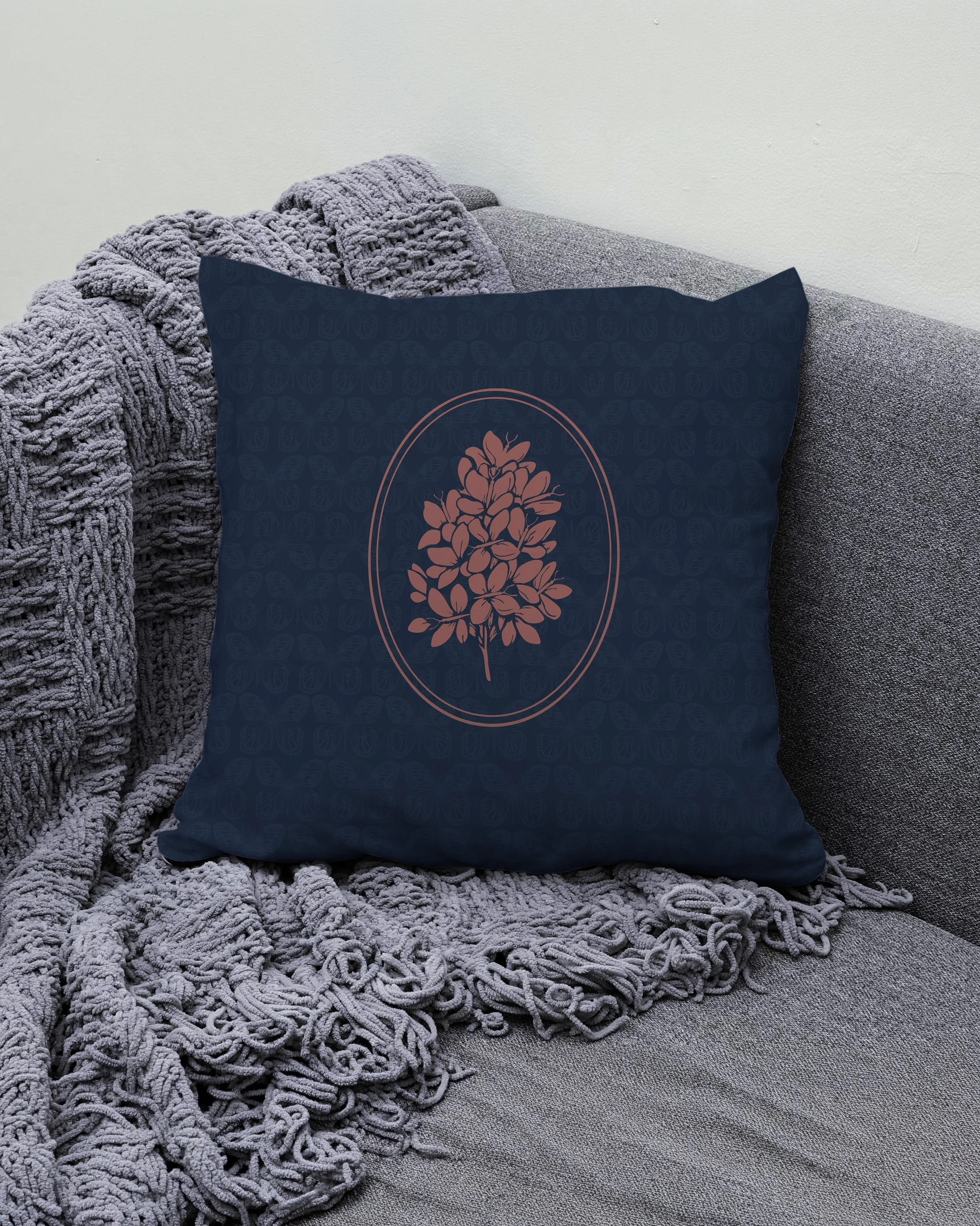
Color
The palette stayed bold, but shifted toward more harmony:
Red moved from a loud accent into a more grounded, cohesive red family
Supporting tones were chosen to feel calm and natural — not sugary
Typography (customized)
The type needed to feel like it belonged to the illustration — organic, connected, and human.
Rather than settling for an off-the-shelf font, an existing typeface was modified by hand:
Adjusted letterforms to feel more natural and cohesive
Tuned the connection and rhythm between “Red” and “Bud”
Refined details until it felt designed — not selected
The Creative Shift
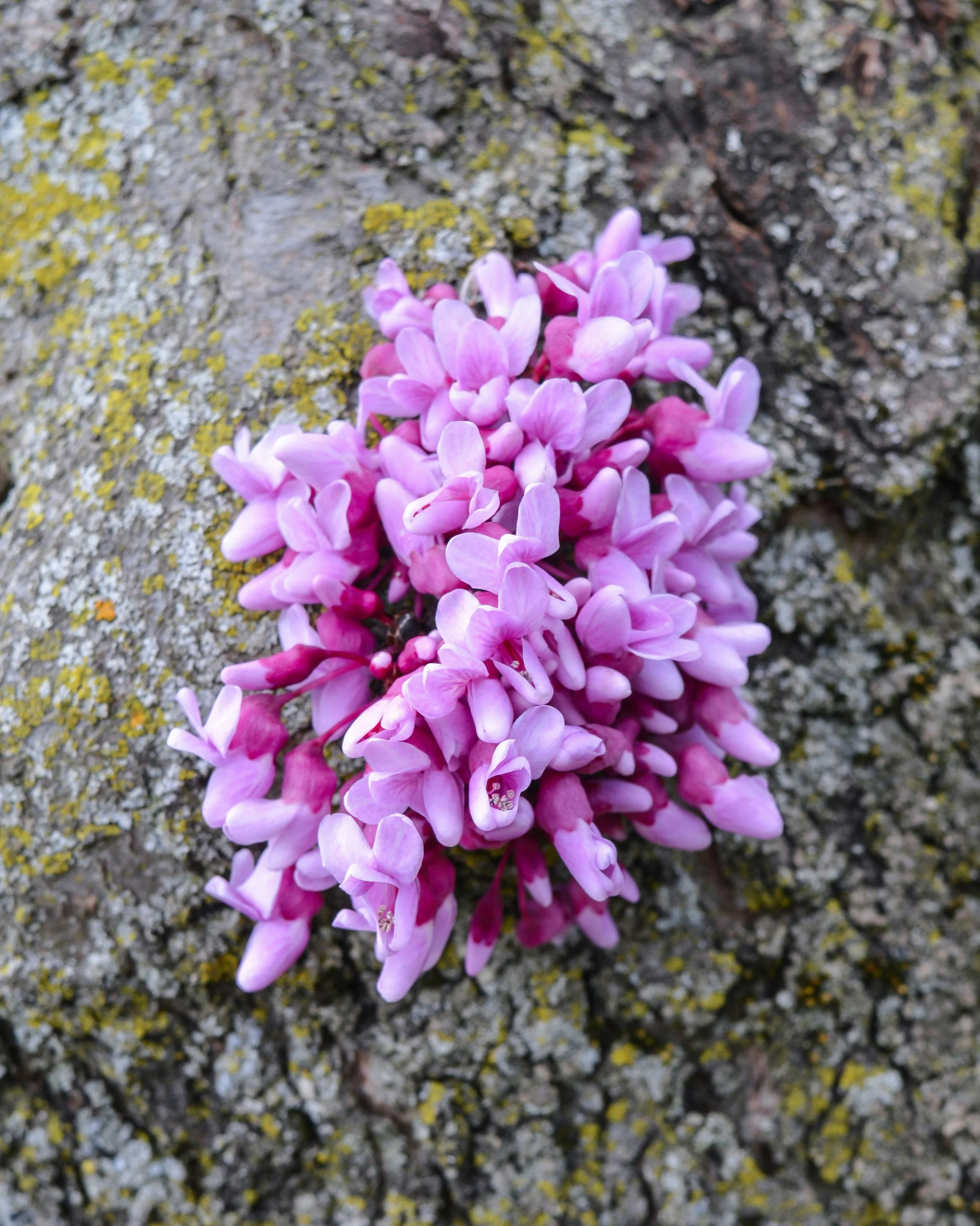
The breakthrough wasn’t adding butterflies.
It was noticing that a simplified redbud blossom already looks like butterflies — clustered, light, and in motion.
So instead of forcing two ideas together, the mark became one integrated image:
A redbud-blossom illustration simplified until it reads like a group of butterflies
Transformation implied — not illustrated
That move let the identity carry the meaning quietly:
If you see butterflies, it works.
If you see redbud blossoms, it works.
If you don’t know the backstory, it still works.
The Experience
The website needed to feel like the brand: calm, clear, and welcoming.
A tone that feels human (not clinical)
A structure that reduces friction and makes next steps obvious
Visual consistency that carries the identity into real-world touchpoints
The Outcome
A brand that feels warm, credible, and quietly symbolic — a solo practice with an identity that carries real meaning, without needing to explain itself.